Content
Mistake 1: Using Low-Resolution Images
Mistake 2: Overloading with Text
Mistake 3: Not Considering Viewing Distance
Mistake 4: Poor Visual Hierarchy
Mistake 5: Ignoring the Banner’s Physical Constraints
Mistake 6: Skipping Professional Help or Design Software
Conclusion

6 Mistakes to Avoid When Designing a Custom Retractable Banner

Dec 18, 2025
5 Minutes Read
0 Views
store-pc doule (1)

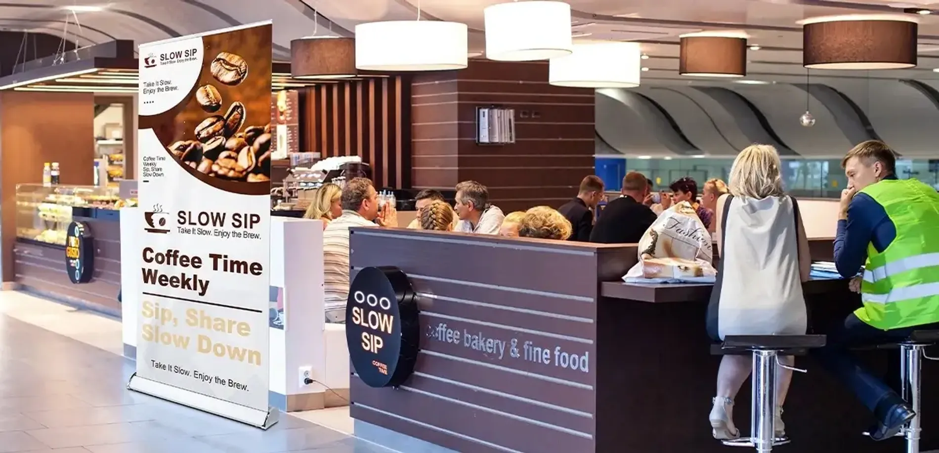
Custom retractable banners (also known as roll-up banners) are one of the most effective tools for trade shows, retail displays, and any promotional event. They’re lightweight, portable, easy to set up, and offer a large visual area to showcase your brand.

Most retractable banner stands on the market are quite similar in structure; they can all be used simply by pulling the banner up from the base. Therefore, design is what truly sets a custom retractable banner apart. A poor design will quickly diminish the banner's effectiveness and waste your marketing budget.

To help you create a standout retractable banner that truly works, we’ve outlined the most common mistakes to avoid and the solutions during the design process. Follow these tips to ensure your banner looks professional, grabs attention, and delivers your message clearly.

Mistake 1: Using Low-Resolution Images

Logos downloaded from websites, social media, or screenshots are often too low in resolution. While they may look sharp on a phone or laptop screen, they become pixelated or blurry when enlarged to an 80-inch-tall banner.

The Fix:

Avoid using images pulled directly from websites, as they are typically low resolution (around 72 DPI). A simple way to check your artwork: Zoom the design to 100% on your screen. If it already looks soft or blurry, it will appear even worse when printed at full banner size.

Whenever possible, use vector files such as .AI, .EPS, or print-ready .PDF for logos and icons. These formats can be scaled to any size without losing quality.

Mistake 2: Overloading with Text

store-pc (1)

A custom banner isn’t a brochure. Most passersby won’t stop to read long blocks of text. They decide whether to engage with your booth in just a glance, and a “wall of text” will almost always cause them to keep walking. So, keep your text concise and to the point.

How to avoid it:

  • Limit your content to 1 headline + 1 supporting line + 1 CTA
  • Replace sentences with short phrases or keywords
  • Let visuals do part of the talking

If your banner must include educational or explanatory content, make sure the headline is large, readable, and attractive. This is the only way to grab a passerby's attention in three seconds—without that, the rest of your message won’t be seen.

Mistake 3: Not Considering Viewing Distance

Your personalized banner isn’t only seen by people standing at your booth; it also needs to communicate clearly to viewers approaching from a distance. Text and graphics that look fine up close may become unreadable from several feet away.

Use large, bold fonts. As a rule of thumb, every 1 inch of letter height provides about 10 feet of readability. Choose high-contrast color combinations (e.g., white text on a dark blue background) to improve visibility. Ensure your main message is clear even if someone only has a few seconds to glance at it.

Mistake 4: Poor Visual Hierarchy

trade-show-pc double (1)

Visual hierarchy refers to the order in which a viewer’s eyes naturally move across your design. On a display banner, the first element people notice is typically the headline or banner signs. They will only continue reading or taking action if that initial message captures their interest.

If everything looks equally important and nothing stands out, viewers will not know where to look first. And if your logo is at the bottom and your content is in the middle, it breaks typical reading patterns and may cause viewers to miss key information.

What to do:

Place your logo and primary message at eye level (usually the top third of the canvas) when designing a banner. Use size and color to emphasize the most important information first, leading the viewer's eye down to the contact information or QR code.

Mistake 5: Ignoring the Banner’s Physical Constraints

Every custom-printed banner has specific size dimensions and safe printing zones. Some designs, placing critical content too close to the edges or the bottom, may be cut off while printing. And for roll-up banners, there is a physical "hidden zone." The bottom 4 to 6 inches of the graphic usually stay inside the metal base or are obscured by the floor-level view.

How to avoid it:

Always use the exact template provided by your printer and follow the recommended safe area margins, which may vary by supplier. Avoid placing text or critical elements too close to the bottom of the banner, as this area may retract into the base.

Mistake 6: Skipping Professional Help or Design Software

While DIY design tools may seem convenient, they often lack the precision and quality control required for professional banners. If you don’t have design experience, working with a professional designer or using reliable design software is a smarter choice. An experienced designer can help you avoid many of the common design mistakes outlined above, as they understand printing specifications, color profiles, and layout principles.

Of course, professional designers or advanced design tools often come at a cost. Westshade makes it simple! All custom products include free design services, so you get expert artwork support without paying more. With high-resolution printing and heavy-duty PET material, our custom retractable banners help your brand stand out instantly at trade shows, promotions, and in-store displays.

choose-show_customizable-design_02

Need more than just banners? Westshade also offers a full range of custom display solutions, from retractable banners to various trade show displays. At Westshade, you can easily build a cohesive, professional brand presence for any event.

Conclusion

From image quality to layout, every design decision affects how your retractable banner performs. Don't let design flaws waste your marketing investment. If you need some inspiration, check out our banner design ideas to help you create a striking, effective display.

Before you hit "print," always do a final "squint test": stand back from your screen, squint your eyes, and see if the most important message still pops. If it does, you’re ready to go!

Related articles
Design Your Canopy Tent with Westshade
Experience high quality materials and various custom options.
We offer the perfect canopy tent tailored to your needs.
newsletter
Newsletter
Join the newsletter to receive the latest updates in your inbox.
Quick Sharing
facebook
mail
twitter
pinterest
Contents
blog